Monday 9 December 2013

Image analysis for Berenice Abbot


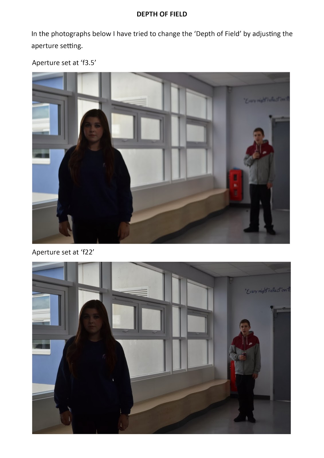
This is a photograph taken by Berenice Abbot, she has used lots of different angles and perspectives to create an interesting image. The use of black and white in the image gives a nice effect. There is a lot going on in the image yet it does not look overcrowded, when you first look at the image your eyes are drawn to the brdige in the background and then you start to look at the buildings further forward. Overall i like this image because i think it is has a nice effect and is interesting to look at.


Berenice Abbott


This is my photograph in the style of Berenice Abbot.

Wednesday 20 November 2013

Image analysis for David Hockney

This is an image by David Hockney, he has taken lots of photographs of a certain area and then placed the photographs together to recreate what the place looked like. I like this image because it is an interesting way to photograph an area and I like how all the pieces (the different photographs) piece together like a jigsaw and you can see that it isn't just one big photograph but they also fit together almost perfectly so you can see what the place looked like. 

Image analysis for Stephanie Jung

This is an image by Stephanie Jung, I like this image because she has layered photographs taken from around the same place which gives a nice effect. There are cars and people in this image and because of the layered photographs it looks like they are moving and shows how busy the street is. She has used lots of interesting colours in this image to show all the different lights which draws your attention to the image.  


Image analysis on Dan Arkle


This is an image by Dan Arkle and is what i based my 'Planet Kenton' image on. I like the style Dan Arkle has used because it is interesting, it gets your attention and it is a unique type of image. The image is in the shape of a sphere which slighlty alters the objects in the image and makes them a weird shape and makes them interesting to look at.

Hockney Joiner 2


Friday 15 November 2013

Hockney Joiner


This is my example of a Hockeny Joiner image focusing on just the face of my model.

Monday 21 October 2013

Dan Arkle style image


This is my image in the style of Dan Arkle. I used my panoramic image and then used a filter to make it look like the above image.

Panoramic Image


 This is my panoramic photograph. To create the panoramic image I merged my photographs together in photoshop using the photomerge tool .

Monday 7 October 2013

My Lighting Photographs


This is my example of photographs using hard and soft light.


Stephanie Jung Inspired Photograph


This is my Stephanie Jung inspired photograph. I took 20 photographs of the same place, changing the angle of the camera slightly and then layered all my images on photoshop. i changed the opacity of all my layers to create the effect i have above.

My Depth of Field Photographs


This is my example of photographs using depth of field.

My Action Photographs


These are the photographs i have taken as an example of action photography.

Example of Depth of Field


This is a good example of a photograph using depth of field. The gnome in the foreground is out of focus but the gnome in the background is in focus, this means that the photograph was taken using small aperture. I like this image becasue the effective use of depth of field makes the audience look straight to the gnome that is in focus but then they can also see all the other aspects of the image which makes it interesting.

Friday 13 September 2013

Example of Action Photography


Dr Harold Edgerton - Densmore Shute Bends the Shaft, 1938


This is an image by Harold Edgerton and it is a good example of a photograph which uses action. This type of photograph was revolutionary at the time because the use of layers in the image had never been done before. The photograph shows a man playing golf and follows the swing he takes to hit the ball. I like this photograph because unlike other photographs it doesn't show just one moment in time it shows what has happened over a period of a few seconds. The spiral shape created in this image is very interesting and draws the audiences attetion towards the image.


Monday 9 September 2013

My Composition Photograph


This is a photograph I have taken as an example of composition using rule of thirds.

Wednesday 4 September 2013

Example of Good Composition


This image is an example of good composition, the rule of thirds has been used and so the focal point is on one of the four intersecting points created when you divide the camera's viewfinder into nine equal-sized sections using two horizontal and two vertical lines. The focal point in this image is the tree which is located to the right of the image, automatically drawing the audience to that part of the image.

Introduction

My name is Cassie Green and i am studying GCSE photography in Kenton School. I have been doing this course for a year so far and I have made this blog as a place to upload and share my photographs. I am currently working on an environment project , looking at different photographers and the style of their photographs to get ideas and then use those ideas to create my own work. During this project I will be able to discover a wide range of different genres including: Portraiture; Landscape; Still Life; Narratives; Documentry and Animation.